
Heritage and Innovation
As we enter December, we hope this message finds you in good health and prosperity.
To express our gratitude for your continued patronage, we present you with our 2026 calendar.
For this new year, we deliver a calendar that encapsulates the feelings that ZACROS has woven together.
Since ZACROS has devoted itself to challenges of the times and to creating new value originality rather than imitation.
This pioneering spirit is the DNA we proudly inherited.
For this calendar, we chose to explore who we are today by looking inward to rediscover the essence of our products.
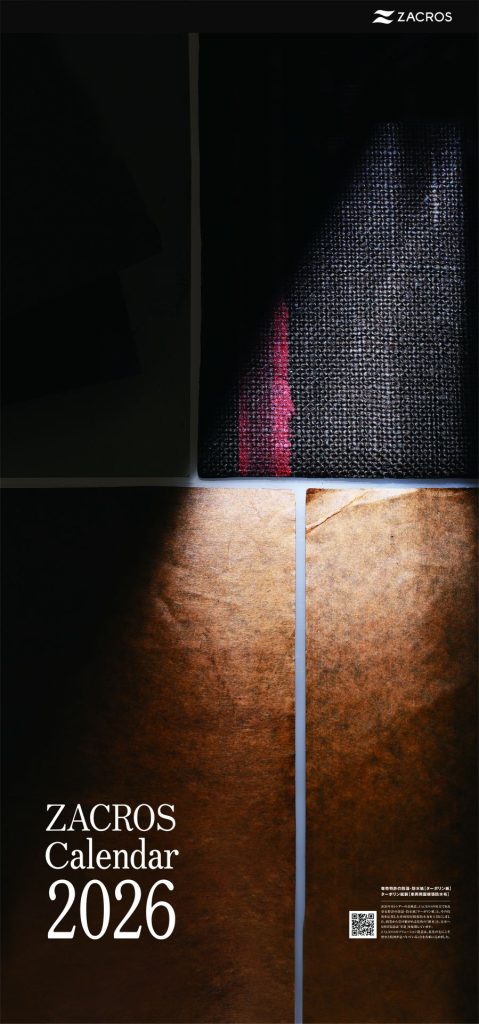
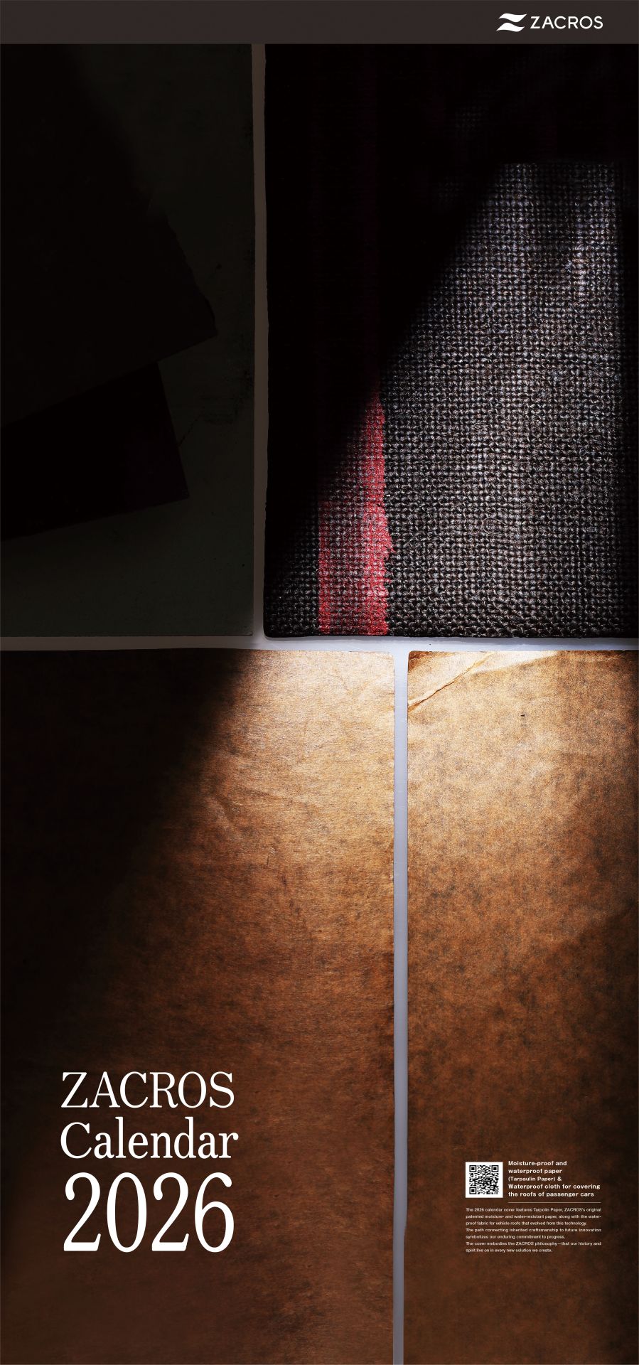
The cover features a product from our earliest days, a symbol of the spirit we have inherited through generations.
Throughout the calendar, we showcase our current lineup and tell the story of how that same spirit continues to evolve.
With a fresh perspective, we reimagined our products as art — a symbol of the innovation that carries ZACROS’s unique creativity forward into the future.
What ZACROS creates is more than just containers or films.It is our passion to wrap, protect, and deliver beautiful things to the future.
Infusion bags for premixed drugs are designed to nurture health and beauty within the body.
Facial serum packaging is designed to preserve skin’s beauty.
Film that protects precision equipment is designed to allow delicate mechanisms to function flawlessly.
In order to protect beauty, we have pursued it more passionately than anyone else.
Our “embracing spirit,” built through carefully accumulated ideas and effort, embodies the creativity of ZACROS that resides in each and every product.
Month by month, you will discover the “trajectory of beauty” that we have built together.
As a solution-creating company guided by the principles of succession and innovation,
we remain committed to building a better future together through the creative power of beauty.
We sincerely wish you a wonderful and prosperous 2026.

表紙
The 2026 calendar cover features Tarpaulin Paper, ZACROS’s original patented moisture-proof and waterproof paper, along with the waterproof cloth for covering the roofs of passenger cars that was developed using this technology.
The path connecting inherited craftsmanship to future innovation symbolizes our enduring commitment to progress.
The cover embodies the ZACROS philosophy—that our history and spirit live on in every new solution we create.
January to December (Click on the screen to go to the work description page)
We use works created through trial and error between the calendar committee and production companies, and the QR codes are links to sites related to each product.
Next to the QR codes, we subtly include the “name of the photographed product” and “comments from the calendar committee.”


Title and Key Features of Each Work
Heritage and Innovation
-
The 2026 calendar cover features Tarpaulin Paper, ZACROS’s original patented moisture-proof and waterproof paper, along with the waterproof cloth for covering the roofs of passenger cars that was developed using this technology. The path connecting inherited craftsmanship to future innovation symbolizes our enduring commitment to progress. The cover embodies the ZACROS philosophy—that our history and spirit live on in every new solution we create.
About our company
January, snow
-

To convey insulation and cooling performance, dry ice and smoke were used to evoke the atmosphere of a commercial freezer creating a crisp, cold ambiance. The metallic texture of aluminum foil and vapor-deposited film highlights the distinctive functional beauty and robustness of Hi-P. A true story from the shoot—staff were astonished by how the dry ice remained cold without feeling cold to the touch—speaks to the product’s remarkable insulating capability.
The products description website featured in the photo
February, choco
-

Through repeated exploration and refinement, we moved from an initial cityscape-like layout to a minimalist composition that highlights the material’s inherent appeal. A red PTP sheet was placed as an accent, naturally guiding the eye and adding depth to the scene. The pristine seal of the unopened secondary pharmaceutical package imparts a subtle sense of tension—symbolizing the quiet vigilance that safeguards each medicine.
The products description website featured in the photo
March, departure
-

Featuring secondary pharmaceutical packaging and the T-TAS chip as the main subjects, the composition achieves simplicity with a sense of depth and refinement. A striped background adds dimensionality and artistry, while the elegant mirrored reflection below symbolizes the precision and quiet presence of the technologies that support modern healthcare.
The products description website featured in the photo
April, beginning
-

Depicting a lineup that expands from tube-type pouches into diverse sizes, the composition conveys an artistic sensibility beyond that of a standard product catalog. The floating appearance of the front-right tube and the delicate reflection of the central spout on the mirror surface create a striking visual impact. The image symbolizes how refill pouches have become seamlessly integrated into everyday life—embodying the quiet evolution of technology that continues to expand.
The products description website featured in the photo
May, bloom
-
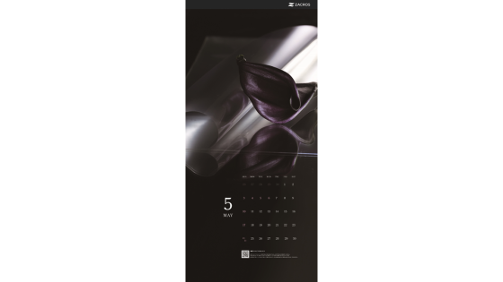
Capturing the symbolic “moment of release” of the FILMBYNA peel-off film, the composition accentuates its high transparency and smooth texture. The accompanying violet hue—symbolizing “dreamlike beauty”—enhances FILMBYNA’s noble and delicate presence. With a deliberately restrained palette balanced by soft white reflections, the image conveys a sense of quiet dignity and refined sophistication.
The product description website featured in the photo
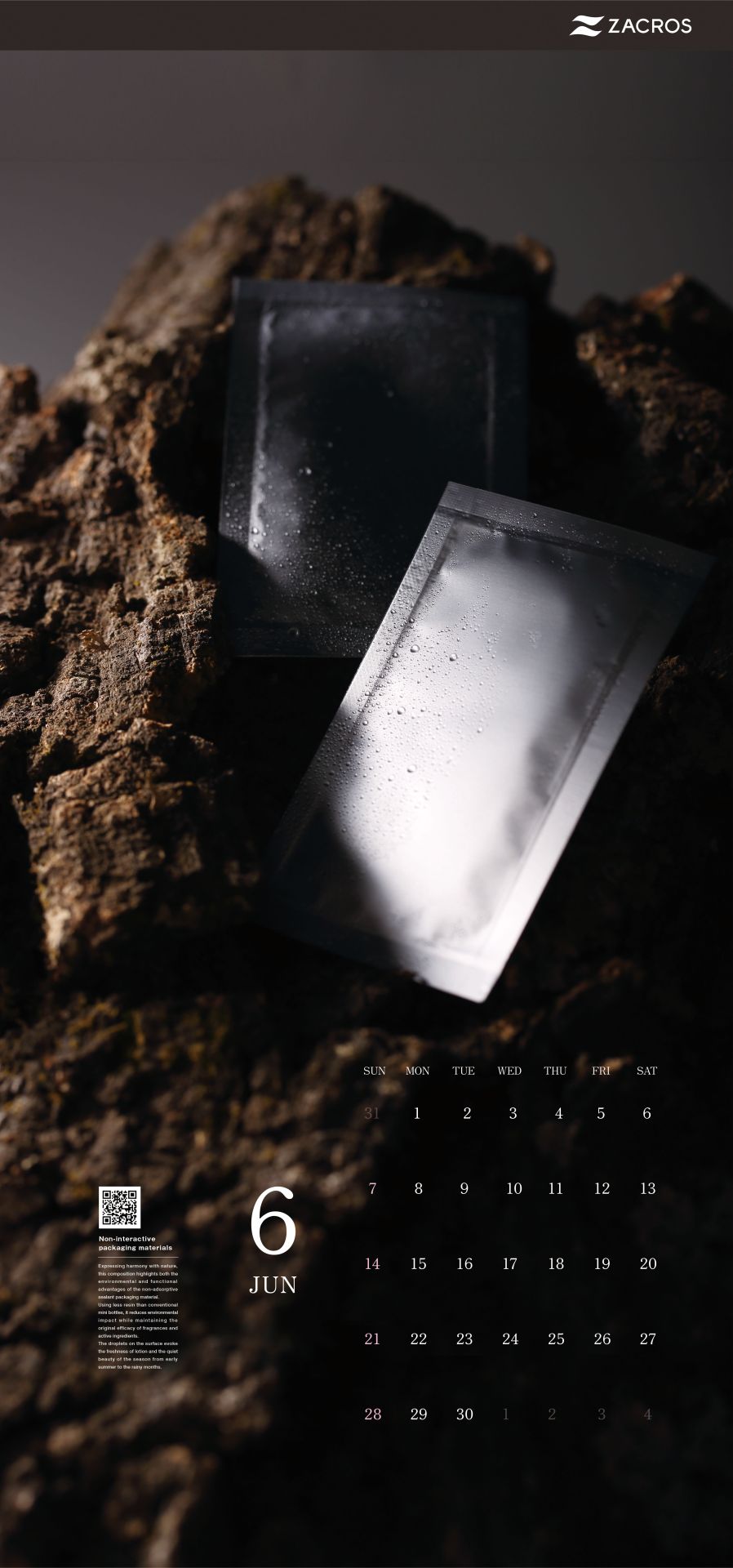
June, mist
-
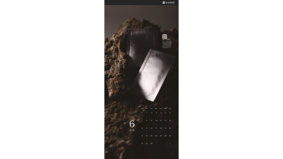
Expressing harmony with nature, this composition highlights both the environmental and functional advantages of the non-adsorptive sealant packaging material. Using less resin than conventional mini bottles, it reduces environmental impact while preventing the adsorption of fragrances and active ingredients, thereby preserving their original efficacy. The droplets on the surface evoke the freshness of lotion and the serene beauty of the season from the rainy months through early summer.
The product description website featured in the photo
July, blue
-

Within a monochromatic world, color is reserved only for the central infusion bag—emphasizing its presence as a vessel that sustains life. The cool gradations of blue within the liquid, combined with the monochrome treatment proposed by photographer Mr. Nagata, create a heightened sense of stillness and tension. The image captures the quiet strength that resides in medical environments where life is continually preserved.
The product description website featured in the photo
August, sparks
-

Utilizing the vivid red and yellow tones of the wavelength-absorbing adhesive film, the material was rolled into varying cylindrical forms to transmit light—creating the gentle warmth of a lantern. Light-diffusing adhesive film was used for the brighter glow in the background, producing a contrast between translucent yellow and soft milky hues. The result is an evocative image where the warmth of light in darkness harmonizes with the delicate transparency unique to film.
The products description website featured in the photo
September, glow
-

Light, symbolizing the source of life, appears to flow through the tubes into the BioPhaS system—expressing the strength of the technology that supports biopharmaceutical production. The illumination within the tubes evokes the movement of life itself. At first glance abstract, yet revealing the form of the BioPhaS upon closer inspection, the image quietly conveys the meaning behind its presence.
The product description website featured in the photo
October, Jack-o’-lantern
-

This composition brings together 5L to 20L Cubitainers—from their folded to expanded forms—to express the versatility and functionality of the container. Arranged around a central Cubitainer, the layout visually reinforces its role as a vessel that protects its contents. The sophisticated tone and lighting lend a sophistication beyond conventional product photography, accentuating the texture and presence of the material.
The product description website featured in the photo
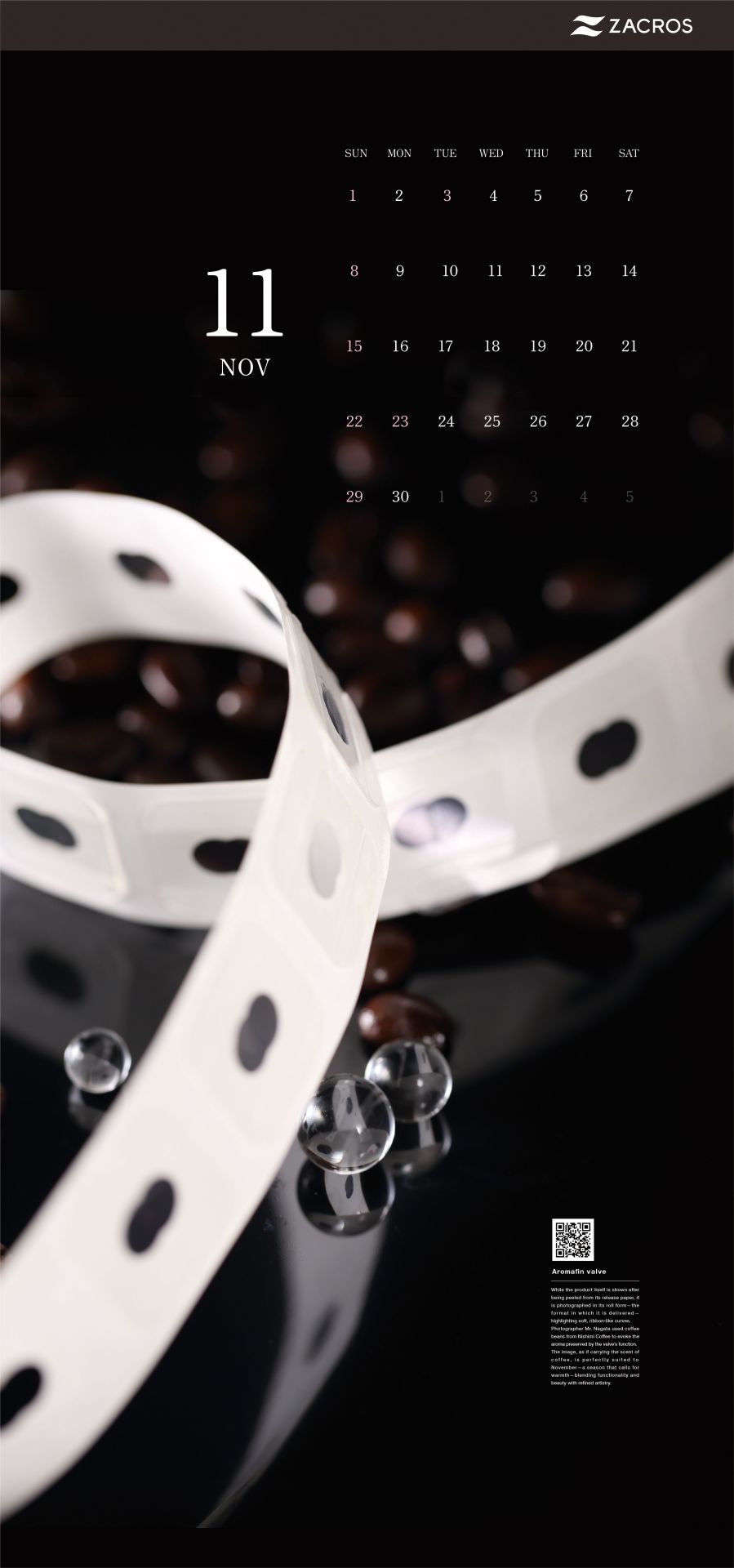
November, coffee
-
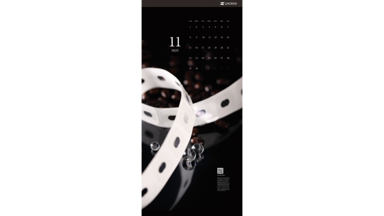
While the product itself is shown after being peeled from its release paper, it is photographed in its roll form—the format in which we deliver it—highlighting soft, ribbon-like curves. Photographer Mr. Nagata used coffee beans from Nizaimi Coffee to dramatically showcase the aroma preservation enabled by the valve’s function. The image, as if carrying the scent of coffee, is perfectly suited to November—a season that calls for warmth—blending functionality and beauty in refined artistry.
The product description website featured in the photo
December, illumination
-

Layering a polarizer protective protection film over a black PP sheet and illuminating it with LED tape light highlighted its high transparency and beautiful reflections. The spread of light across the surface evokes a cityscape at night, while the shadows seem to gently envelop and protect the product. Though invisible in the final product, the film plays a vital behind-the-scenes role in protecting polarizers and displays—an image that expresses both its quiet presence and the warmth woven by light and shadow.
The product description website featured in the photo
Credits/Production Cooperation
LASIENNE production Co., Ltd. (link)
Produce: Aya Kataoka
Assistant: Kouta Shimano
Driver: Daiki, Maki
STUIDO ABU
Photo: Akihito Nagata(Instagram:@abu888)
Assistant: Yumi Kobayashi
BOKURA TO SHIGOTO Inc. (link)
Creative Direction: Hayato Fukazawa
Design: Hiroyuki Hirao
Print: Sakawa Printing Co., Ltd. (link)
Planning & Concept:
2026 ZACROS Calendar Creative Team
(Amira, Yukino, Tatsuya, Tomomi & Harutoshi)